Data Preprocessing Part 2 and Random Forests
My previous post explored techniques for cleaning and pre-processing datasets prior to using machine learning techniques. This post will continue where the previous one left off. The central dataset for these two posts is the University of Wisconsin Breast Cancer Dataset on Kaggle.com
Introduction
Trees are amazing.
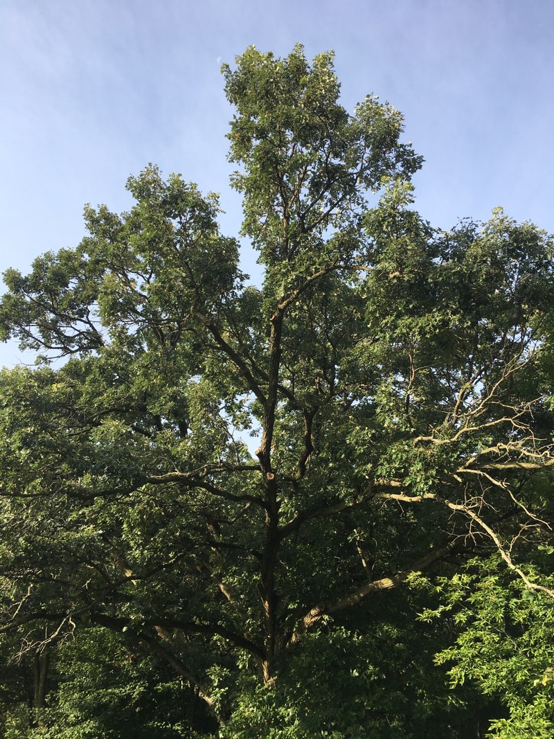
In mathematics, trees can be found in a number of different topics including fractal geometry.
import matplotlib.pyplot as plt
import math

class FractalTree:

    def __init__(self):
        plt.title("Fractal Tree")
        plt.figure(1)
        plt.axis((0, 600, 600, 0))

    def drawTree(self, x1, y1, angle, depth):
        if depth:
            x2 = x1 + int(math.cos(math.radians(angle)) * depth * 10.0)
            y2 = y1 + int(math.sin(math.radians(angle)) * depth * 10.0)
            plt.plot([x1, x2],  [y1, y2], 'g-')
            print(x1, y1, x2, y2)
            self.drawTree(x2, y2, angle - 20, depth - 1)
            self.drawTree(x2, y2, angle + 20, depth - 1)


if __name__ == "__main__":
    ft = FractalTree()
    ft.drawTree(300, 550, -90, 9)
    plt.show()
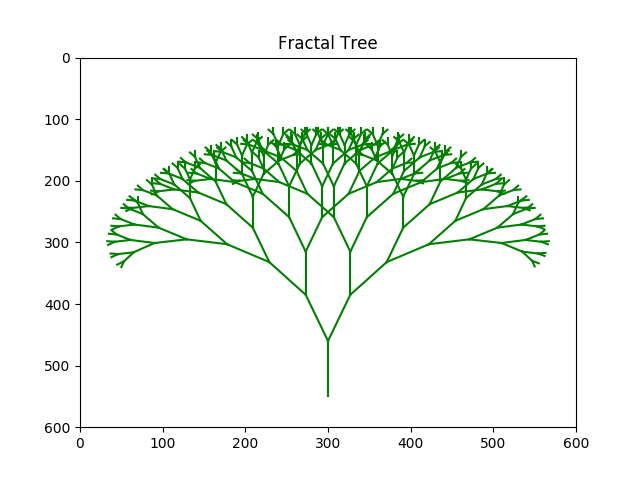
Fractal trees don’t directly pertain to the topic of random forests, but they are still very cool. You can read more about them here.
Another interesting use of trees in mathematics and statistics can be found in the use of Random Forests as a machine learning technique. Shortly, we will explore how random forests work, but first we need to wrap up one detail from the last post.
Revisiting the Correlation Matrix
In the last post we explored how data related to my lazy cat Parker could be visualized in a correlation matrix. We started with a table that looks like this:
Day,		Meows,	Sleeping,	Hariballs,	Bed,	Sunshine,	Litterbox,	Eating,	Drinking,	Counter
Sunday,		14,		903,		2,			722,	181,		2,			3,		5,			4
Monday,		18,		1100,		0,			836,	264,		1,			4,		6,			5
Tuesday,	22,		850,		0,			697,	153,		4,			3,		5,			4
Wednesday,	18,		917,		1,			724,	193,		2,			5,		4,			2
Thrusday,	16,		856,		0,			693,	1663,		4,			4,		5,			6
Friday,		21,		1341,		0,			1059,	282,		1,			3,		6,			12
Saturday,	97,		872,		2,			723,	149,		3,			5,		7,			14
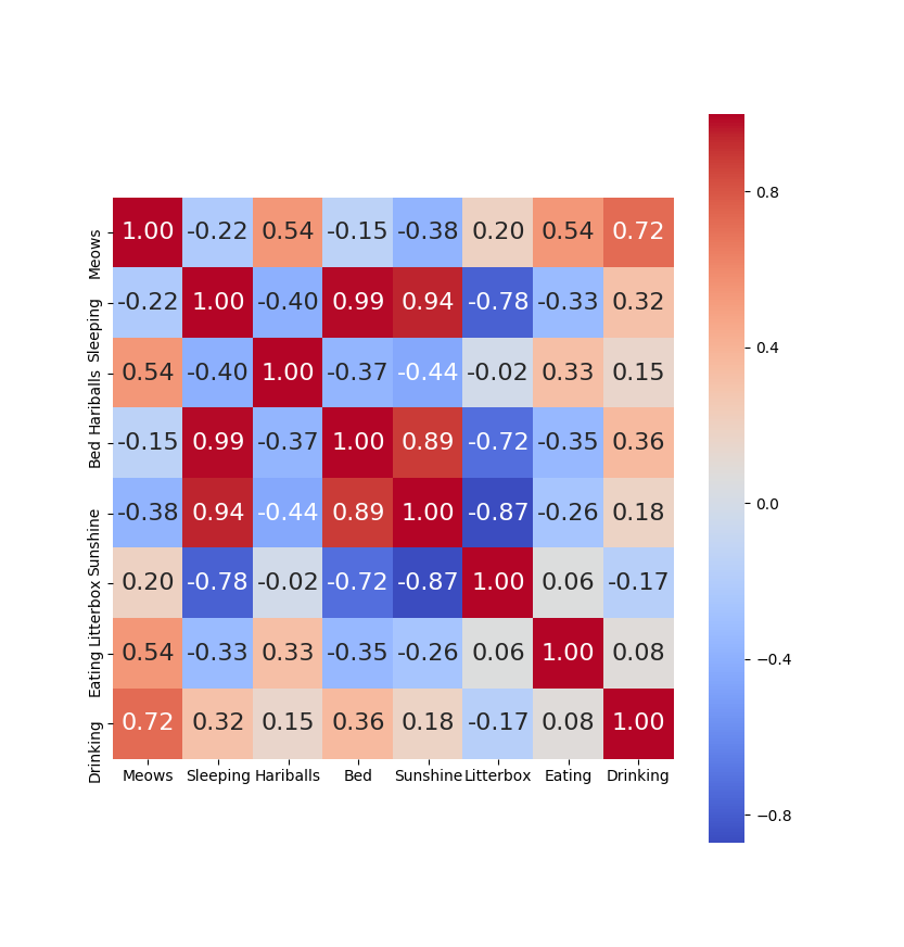
Correlation matrices are a great way to visually identify data that is somewhat redundant in machine learning training sets. A correlation matrix shows the correlation between all the pairs of columns in a data set. In Manish Kumar’s analysis of the Breast Cancer data set on Kaggle, he presents a “heatmap” version of the correlation matrix. You may recall the correlation matrix for the “Lazy Parker” data in my last post:
Another way to view that same data is to view it as a clustered heat map. A clustered heat map will display the same data but group the highly correlated items together. Here is a modified bit of code from the last post that shows how to do that, and the result. (The change is simply modifying the “sns.heatmap(..” line to be “sns.clustermap(…”)
import pandas as pd
import matplotlib.pyplot as plt
import seaborn as sns # used for plot interactive graph. I like it most for plot


class ParkerSortedCorrelationMatrix:

    def do_correlation_matrix(self):
        pdata = pd.read_csv("./data/parker_sleeping.csv", header=0)
        pdata.drop("Day", axis=1, inplace=True)
        pdata.drop("Counter", axis=1, inplace=True)
        data_cols = list(pdata.columns[0:8])
        corr = pdata[data_cols].corr()
        plt.figure(figsize=(14, 14))
        sns.clustermap(corr, cbar=True, square=True, annot=True, fmt='.2f', annot_kws={'size': 16},
                    xticklabels=data_cols, yticklabels=data_cols,
                    cmap='coolwarm')
        plt.show()

if __name__ == '__main__':
    pscm = ParkerSortedCorrelationMatrix()
    pscm.do_correlation_matrix()
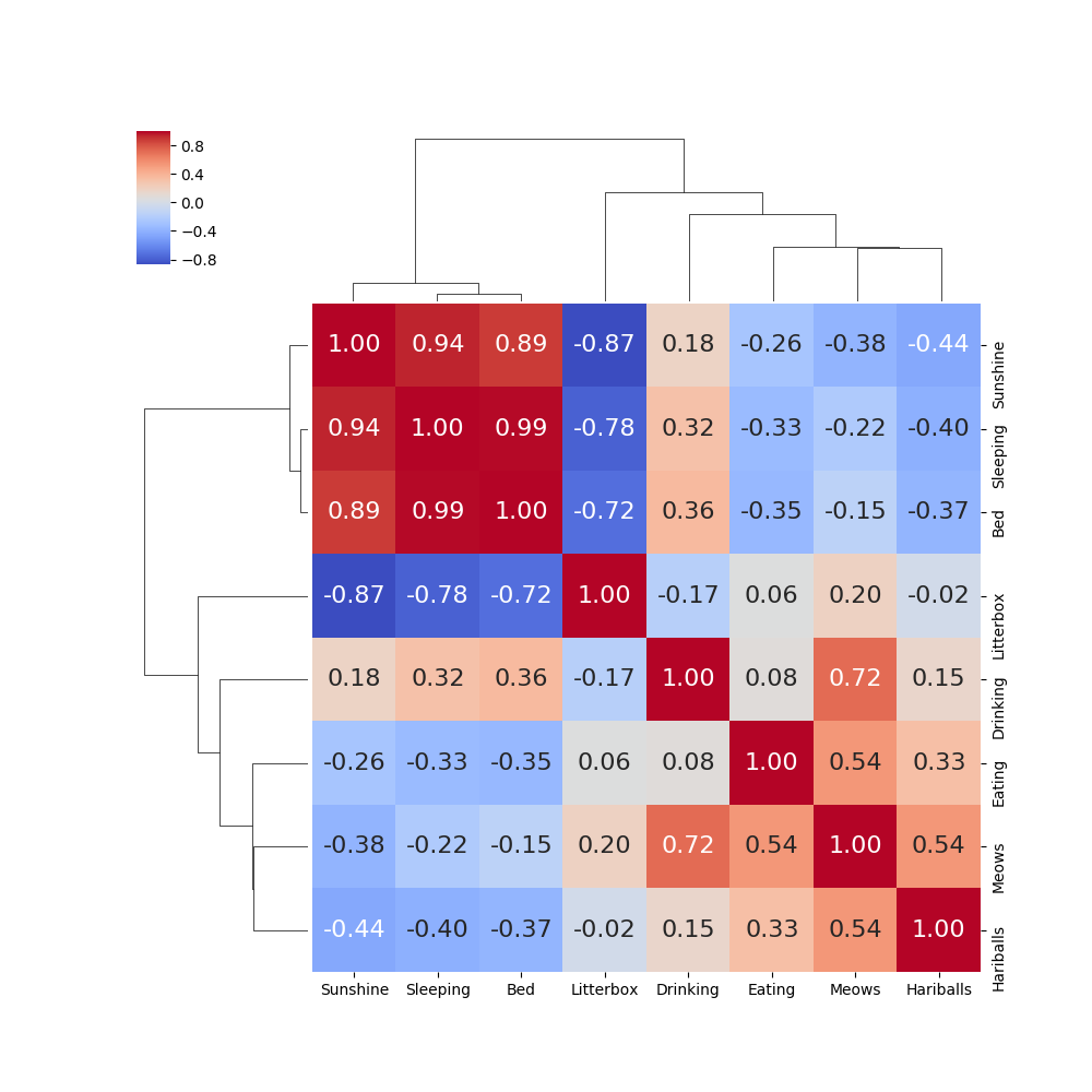
Now it is very easy to see that “Sunshine”, “Sleeping” and “Bed” are highly correlated data.
If we wish to do the same thing for the correlation matrix for the columns in the breast cancer dataset, we get the following: (Note that we have reduced the dataset to just the “mean” values.)
    def do_correlation_matrix(self, drop_cols):
        pdata = pd.read_csv("./data/data.csv", header=0)
        for d in drop_cols:
            pdata.drop(d, axis=1, inplace=True)

        data_cols = list(pdata.columns[0:11])
        corr = pdata[data_cols].corr()  # .corr is used for find corelation
        g = sns.clustermap(corr, cbar=True, square=True, annot=True, fmt='.2f', annot_kws={'size': 8},
                    cmap='coolwarm', figsize=(8, 8))
        plt.setp(g.ax_heatmap.yaxis.get_majorticklabels(), rotation=0)
        plt.setp(g.ax_heatmap.xaxis.get_majorticklabels(), rotation=90)
        plt.show()
        g.savefig("pretty_map")
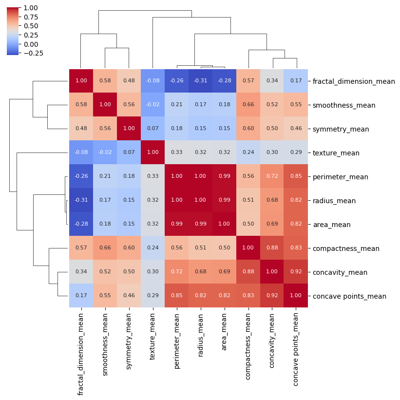
Now it is very clear which columns in the dataset have the highest correlation.
A word of caution: I have found it somewhat difficult to format seaborn heat maps and cluster maps. For best results, I have used the “save fig” method that is available on the returned object when creating these maps.
Random Forests
We will now turn our attention to the machine learning technique used by Manish Kumar. That technique is called Random Forest. Coursera offers a course on Practical Machine Learning from Johns Hopkins that has a section specifically on Bagging, Boosting and Random Forest. The section on Random Forests is particularly good, and I recommend it.
Another good explanation of Random Forest can be found in this youtube video by Thales Sehn Körting.
Random Forest uses multiple decision trees. These trees are built by taking random subsets of the columns of the entire dataset. Each subset of columns is then used to create a decision tree and multiple trees are used. This image from the Körting video gives a good idea what is happening. Note that each subset contains a column “C” that represents the classification for the data.
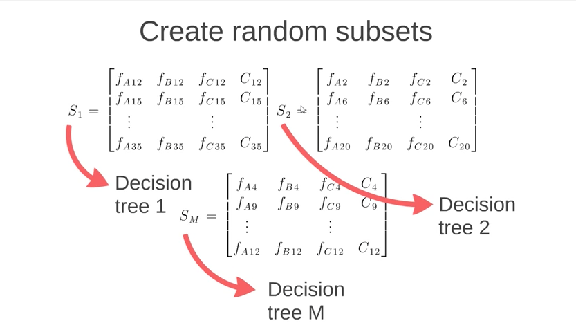
The algorithm then predicts classification of data by running that data through all of the decision trees in the “Random Forest”. The final classification is made by allowing each decision tree to “vote” on what it determines is the classification. The classification with the highest number of votes is the one that wins.
Note: Please refer to the github repo for the complete code for this blog post.
One thing that I wanted to point out is that Manish Kumar, as far as I can tell, does not preprocess the data before using his Random Forest approach. (I could have missed it, but it didn’t jump out at me.) Preprocessing has the following impact on the breast cancer data set (again, see the previous blog post):
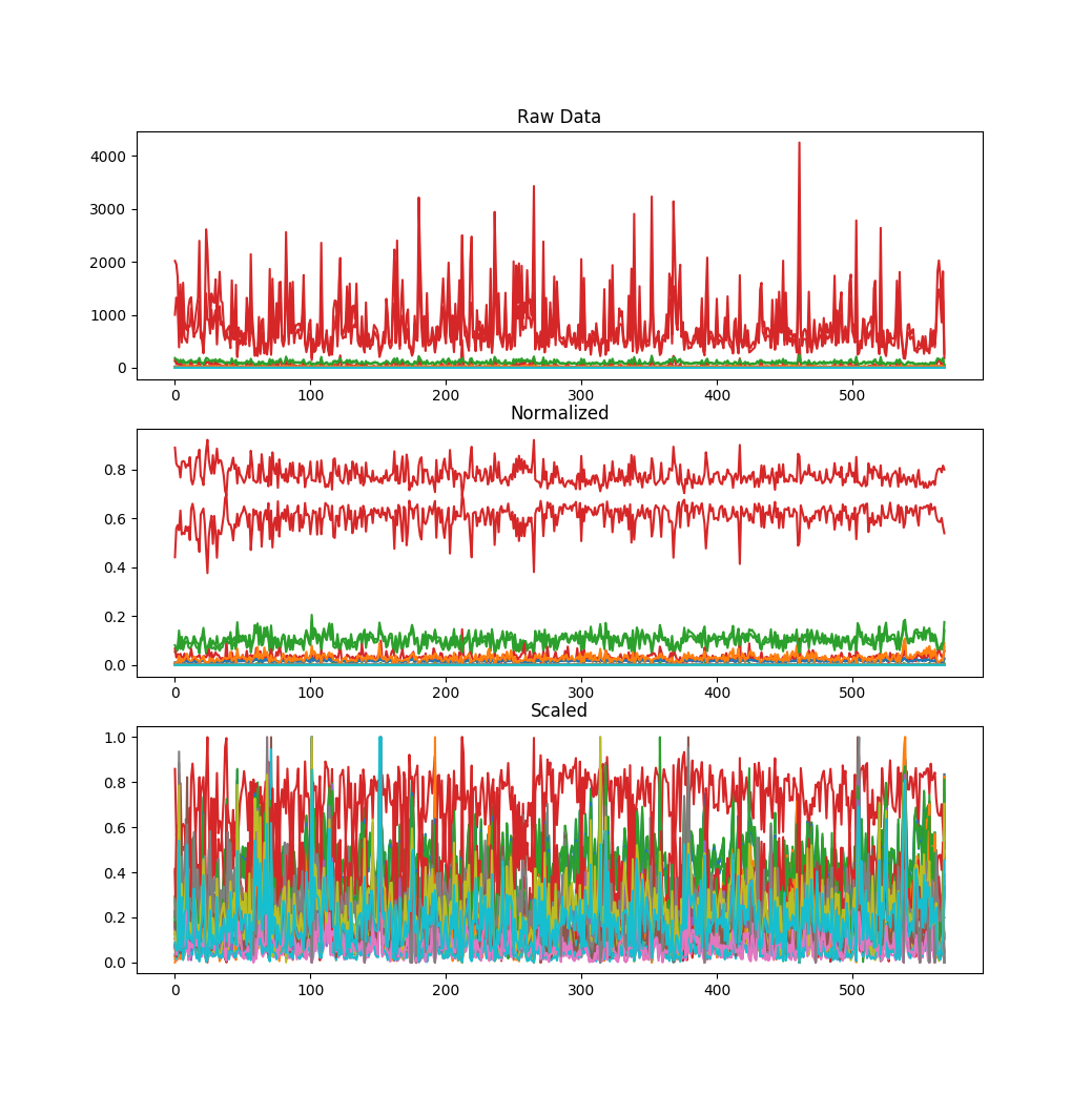
Code to run the random forest prediction for the breast cancer dataset looks like this: (Again, credit to Manish Kumar for writing the code that the following borrows heavily from.)
    def do_machine_learning_random_forest(self):
        data = pd.read_csv("./data/data.csv", header=0)
        data.drop("Unnamed: 32", axis=1, inplace=True)
        data.drop("id", axis=1, inplace=True)
        data['diagnosis'] = data['diagnosis'].map({'M': 1, 'B': 0})
        data = self.preprocess_data(data, preserve="diagnosis")
        prediction_var = ['fractal_dimension_mean',
                          'smoothness_mean',
                          'symmetry_mean',
                          'radius_mean',
                          'texture_mean',
                          'compactness_mean']

        train, test = train_test_split(data, test_size=0.3)
        train_X = train[prediction_var]
        train_y = train.diagnosis
        test_X = test[prediction_var]
        test_y = test.diagnosis

        model = RandomForestClassifier(n_estimators=100)

        model.fit(train_X, train_y.astype(int))

        prediction = model.predict(test_X)
        accuracy = metrics.accuracy_score(prediction, test_y)
        plt.show()
        print("Calculation complete.  Random Forest Accuracy: {0}".format(accuracy))
        return accuracy
I ran the random forest experiment 1000 times. The first 500 I did NOT preprocess the data. The second 500 I did preprocess (scale and normalize) the data. The results are as follows for the average, min and max accuracy of the experiment:
		Preprocessing
		No		Yes
Average		92.68%		94.95%
Min		87.13%		90.06%
Max		97.66%		98.83%
The increase in accuracy is evident, but not overwhelming. That may be due in large part to the fact that main data components are relatively of the same scale already.
Neural Network Comparison
An alternative technique that I have used in the past that I believe works particularly well for classification problems that have two classes is to use a simple neural network with a final output layer that uses the arctangent function. Training targets of the two classes can be mapped to -1 and +1. A standard back propagation can be used for the network, and a network of one hidden layer can typically do a pretty good job of predicting the outcomes. Here are the results of doing that with the scaled normalized data found in this dataset:
(This is some pretty long ugly code, so I apologize in advance.)
    def do_neural_network_estimation(self):
        data = pd.read_csv("./data/data.csv", header=0)
        data.drop("Unnamed: 32", axis=1, inplace=True)
        data.drop("id", axis=1, inplace=True)
        data['diagnosis'] = data['diagnosis'].map({'M': 1, 'B': -1})
        data = self.preprocess_data(data, "diagnosis")
        prediction_var = ['fractal_dimension_mean',
                          'smoothness_mean',
                          'symmetry_mean',
                          'radius_mean',
                          'texture_mean',
                          'compactness_mean']
        train, test = train_test_split(data, test_size=0.3)

        train_X = train[prediction_var]
        train_y = train.diagnosis
        test_X = test[prediction_var]
        test_y = test.diagnosis

        model = Sequential()
        model.add(Dense(6, input_shape=(6,), activation='relu'))
        model.add(Dense(100, activation='softmax'))
        model.add(Dense(1, activation='tanh'))
        model.compile(optimizer='rmsprop',
                      loss='mean_squared_error')
        model.fit(train_X.values, train_y.values, batch_size=100, epochs=2000, verbose=False)

        correct_m = 0
        correct_b = 0
        type_I = 0
        type_II = 0

        for x in range(0,len(test_X.values)):

            i = np.reshape(test_X.values[x], (1, 6))
            estimate = model.predict(i)

            if estimate > 0 and test_y.values[x] > 0:
                correct_m = correct_m + 1
            if estimate < 0 and test_y.values[x] < 0:
                correct_b = correct_b + 1
            if estimate > 0 and test_y.values[x] < 0:
                type_I = type_I + 1
            if estimate < 0 and test_y.values[x] > 0:
                type_II = type_II + 1

        a = (correct_m + correct_b) / len(test_X.values)
        print("\n\n{0},{1},{2},{3},{4}\n\n".format(correct_b, correct_m, type_I, type_II, a))
The learning curve for the neural network approach is:
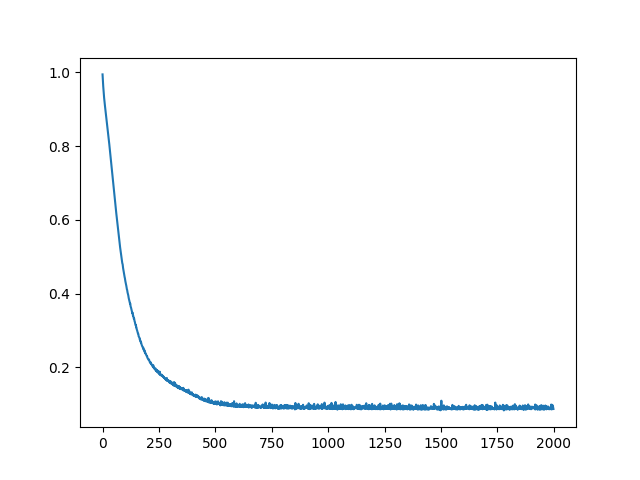
Results from the neural network approach to the classification problem were:
Neural Network Breast Cancer Cell Classification
Correct (B) . . . . . . 101
Correct (M) . . . . . . 65
False Positives (I) . . 2
False Negatives (II). . 3
Accuracy. . . . . . . . 0.9707602339181286
The learning curve bounces around a bit toward the end which results in some variation of the final accuracy. This, combined with the fact that the neural network randomizes the initial weights and biases each time means that different training sessions can return a slightly differently trained network. To account for this, I ran the network 25 times and came up with the following results:
Neural Network Breast Cancer Cell Classification 25 Trials
Average		0.964210526
Min		0.929824561
Max		0.994152047
The neural network was more accurate than either of the two random forest approaches. However all of the models were within a few percentage points in accuracy. There may be opportunities to actually make the network perform even better by tuning the parameters and network architecture a bit.
It is also worth mentioning that if the network were trained to 100% accuracy on the data, it is very likely that the model would be “over-fit”. I won’t go into that here, but it might be a good topic for another blog post. When I start to write things like that, it is usually a good time to wrap things up.
Conclusion
This series of blog posts has touched on the following topics:
- Preprocessing data with scaling and normalization
- Identify key columns of data with correlation matrices
- Using “Seaborn” heatmaps and clustermaps to identify highly correlated data (and reduce the number of columns with high correlation)
- Looking at the Random Forest algorithm for categorization.
- Comparing the results of random forest models that have been trained with preprocessed and non-preprocessed data
- Using dense neural networks as an approach to categorize data
- Comparing the results of random forest and dense neural networks on the Wisconsin Breast Cancer Database provided by Kaggle.com and the University of California, Irvine.
I hope you have found this post interesting. I’ll be back after brief break with more topics in data science and machine learning.