Data Preprocessing Part 1
Her text message was simple enough, “Pls tighten filtered water spigot”.
“Great!”, I thought. “A chance for me to do something around here that adds some value rather than writing esoteric blog posts about data science!”
Little did I know.
Introduction
If you have ever worked on a home plumbing project, particularly those that involve the underside of sinks, you have probably experienced the term “knuckle-buster.” Take a look:

The above image is a bottom-up view of the water spigot my wife refers to in her text message. It is, as they say, a real “knuckle-buster”. Not only is there about 1 inch of clearance on either side of the nut, it sits at the top of a narrow gap between the back of the sink and the wall. Tightening that nut is about as much of a challenge as hitting the exhaust vent with a torpedo in order to blow up the Death Star.

Did I mention that the nut was a metric 14mm? I am convinced that nut was also manufactured by the evil empire.
I was able to get the (ahem) thing tightened with the help of my son, some decent back support and The Force. While I was lodged under the kitchen sink, it occurred to me that the sink situation is, in some ways, similar to trying to work with raw data. Often times, there is just a bunch of stuff in the way.
Cleaning Up Data.
Kaggle.com has a breast cancer diagnostic data set that is available for analysis. The data set originates from the University of California Irvine Machine Learning Repository and includes 569 records of data regarding potential breast cancer cells. The data set provides an opportunity to explore machine learning techniques to predict if cells are malignant or benign based on observed characteristics such as radius, perimeter, smoothness etc.
One of the great things about Kaggle.com is that it provides an opportunity to see how others have addressed problems. In the case of the breast cancer data set the following individuals have done some excellent work:
I am particularly impressed with Dr. Bekele and Mr. Kumar for their clean explanations and easy to follow example code. Much of the rest of this post follows from their work.
The interesting thing about this data set is that it contains columns of data that have a very high correlation. In other words, things like radius and area are nearly reporting the same thing. This poses a problem in machine learning because redundant data can easily overshadow the most important features of a data set.
One way to help identify and eliminate redundant data is to create a pair-wise covariance matrix and remove/reduce the number columns that have a high correlation.
To show a simple example of this, I will turn to my trusty cat Parker.

Consider the following table:
Day,		Meows,	Sleeping,	Hariballs,	Bed,	Sunshine,	Litterbox,	Eating,	Drinking,	Counter
Sunday,		14,		903,		2,			722,	181,		2,			3,		5,			4
Monday,		18,		1100,		0,			836,	264,		1,			4,		6,			5
Tuesday,	22,		850,		0,			697,	153,		4,			3,		5,			4
Wednesday,	18,		917,		1,			724,	193,		2,			5,		4,			2
Thrusday,	16,		856,		0,			693,	1663,		4,			4,		5,			6
Friday,		21,		1341,		0,			1059,	282,		1,			3,		6,			12
Saturday,	97,		872,		2,			723,	149,		3,			5,		7,			14
Note: My cat is lazy. This is made up data, but he is still laaaazzzzyyyy.
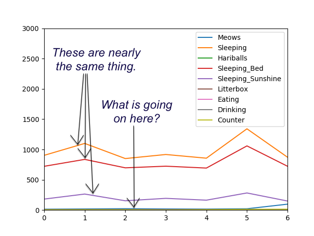
If we were to graph this data, you can clearly see a couple things.
- The sleeping data is really just views of the same thing.
- The minute data for sleeping is in a completely different scale to everything else.

To make this data work better as input to some type of machine learning algorithm, some pre-processing is needed to ensure the following:
- Data columns that have a high correlation are removed from the data set
- The data is scaled so that one column doesn’t dramatically differ from other columns in terms of scale
Mr. Kumar’s post on Kaggle.com has a nice technique for displaying the correlation matrix for a python pandas data frame. The following is a slight modification of that code so that it works well with the made-up Parker data above.
import pandas as pd
import matplotlib.pyplot as plt
import seaborn as sns

...

    def do_correlation_matrix(self):
        pdata = pd.read_csv("./data/parker_sleeping.csv", header=0)
        pdata.drop("Day", axis=1, inplace=True)
        pdata.drop("Counter", axis=1, inplace=True)
        data_cols = list(pdata.columns[0:8])
        corr = pdata[data_cols].corr()  # .corr is used for find corelation
        plt.figure(figsize=(14, 14))
        sns.heatmap(corr, cbar=True, square=True, annot=True, fmt='.2f', annot_kws={'size': 16},
                    xticklabels=data_cols, yticklabels=data_cols,
                    cmap='coolwarm')
        plt.show()
Note that complete code is available in the knuckle_buster git repo for this project.

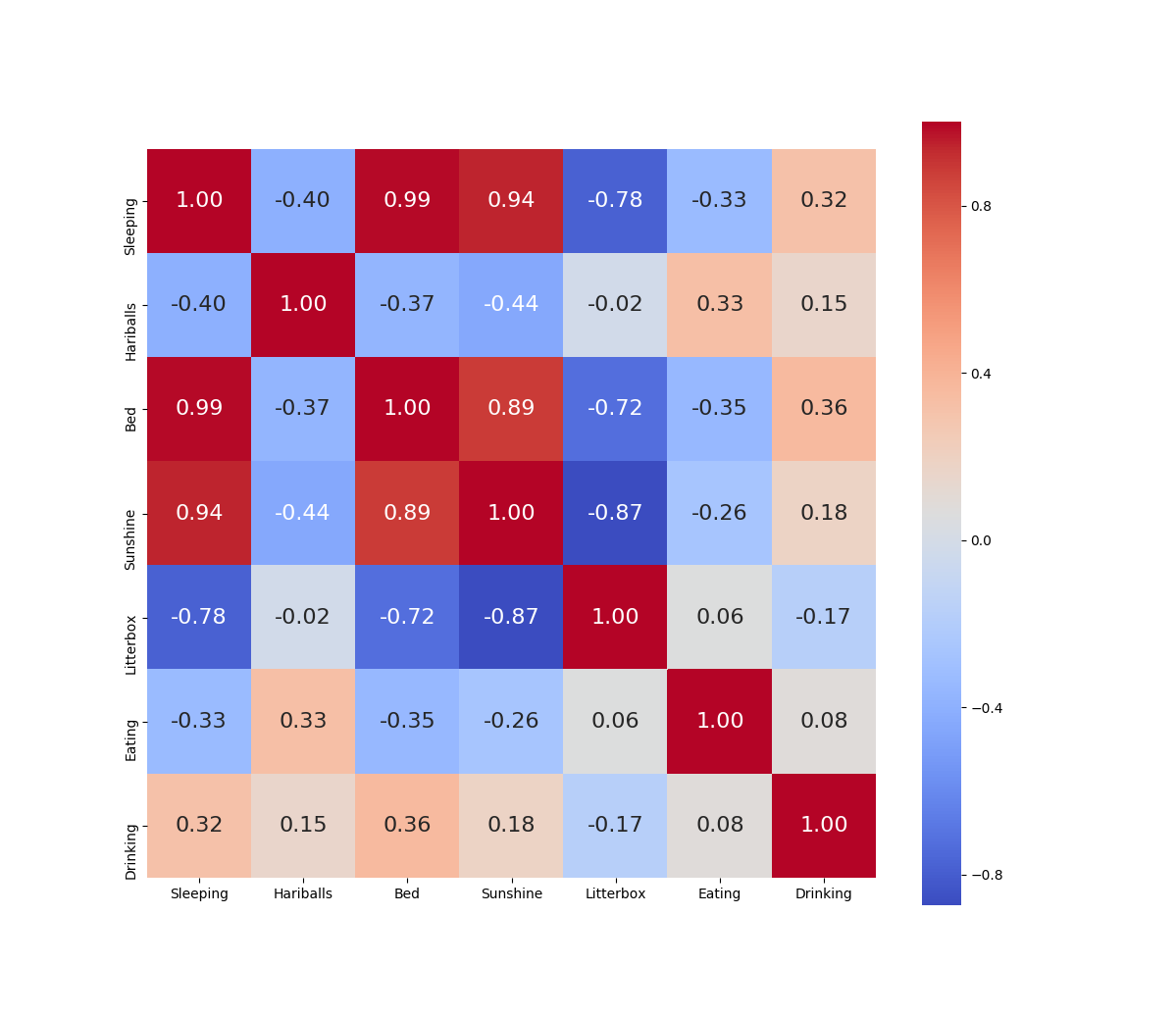
From this graph we can see that the combinations of bed, sunshine and sleeping (which are measured in minutes) are all very highly correlated. I can reduce these columns to just one, and pretty much have the same dimensional representation in my data set.
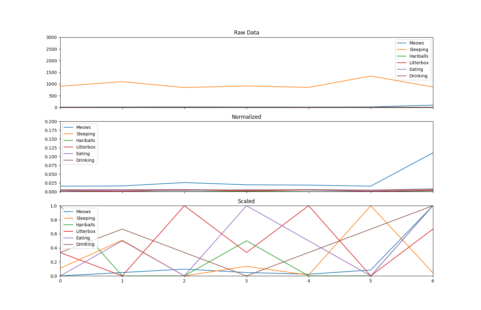
We are part of the way to a good data set for machine learning. We now have a dataset that has less covariance between pairs of columns, however we still have an issue of scaling. The typical way to address this is to scale and normalize the data.
Normalizing and scaling data
Scaling does pretty much what the name implies. It gets all of the data into the same scale. Normalizing is a bit more sophisticated, but not overly so. When we normalize data, we essentially squash it down so that the extremes don’t have an undo impact on the overall set. This stack overflow post goes into some good detail on why this is important for machine learning, and particularly K-Means clustering.
This post by Jeremy Kawahara provides a nice explanation of normalizing vectors for machine learning as well.
The following code shows how to use the sklearn package to do normalization and scaling on the data for Parker…
    def do_data_scaling_an_normalization(self):
        pdata = pd.read_csv("./data/parker_sleeping.csv", header=0)
        pdata.drop("Day", axis=1, inplace=True)
        pdata.drop("Counter", axis=1, inplace=True)
        pdata.drop("Bed", axis=1, inplace=True)
        pdata.drop("Sunshine",  axis=1, inplace=True)
        print("Data:")
        print(pdata)

        pretty_printer = lambda x: str.format('{:.2f}', x)

        nd_normalized = preprocessing.normalize(pdata, norm="l2")


        min_max_scaler = preprocessing.MinMaxScaler()
        nd_scaled = min_max_scaler.fit_transform(pdata)

        fig, (ax1, ax2, ax3) = plt.subplots(3, sharex=True)
        ax1.axis((0, 6, 0, 3000))
        ax1.set_title("Raw Data")
        ax1.plot(pdata)

        ax2.set_title("Normalized")
        ax2.axis((0,6,0, 0.2))
        ax2.plot(nd_normalized)

        ax3.set_title("Scaled")
        ax3.axis((0, 6, 0, 1))
        ax3.plot(nd_scaled)

        ax1.legend(pdata.columns.values.tolist())
        ax2.legend(pdata.columns.values.tolist())
        ax3.legend(pdata.columns.values.tolist())

        plt.show()

PCA - Principle Component Analysis
One thing of particular mathematical significance is how “…the principal components are the eigenvectors of the covariance matrix of the original dataset.” I am not going to dig into that at this time, but rather point the reader at some excellent resources on that subject:
- Laura Hamilton’s blog post on Principle Component Analysis.
- An excellent post by George Dallas
- Dr. Bekele’s post that talks about using R to perform PCA.
Conclusion
The steps outlined above for the lazy Parker dataset are very similar to several approaches used to pre-process the breast cancer dataset on Kaggle.com This blog post is getting a bit long, and so I am going to end it here. My next blog post will return to the cancer data set and go over some different approaches for predicting benign and malignant tumors based on observed cell properties using pre-processed data.
I think I will go get a drink of water now.
I certainly have earned it.
