Linear and Polynomial Regression
The Big Board
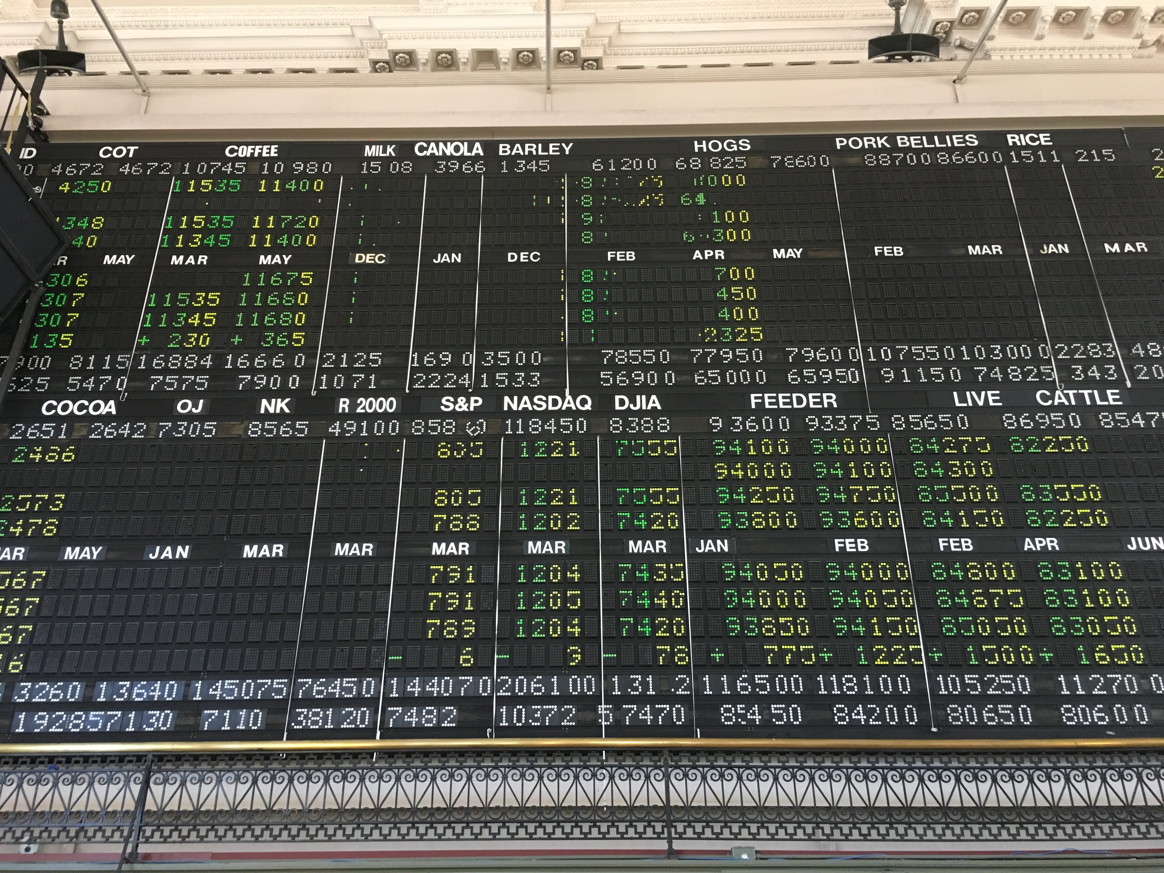
I have been doing research at the CoCo Space in downtown Minneapolis. The space is the former trading floor of the Minneapolis Grain Exchange. One of the coolest things about the space is that the “big board” for commodities prices is still up.
Futures trading involves buying and selling futures contracts…
A futures contract, quite simply, is an agreement to buy or sell an asset at a future date at an agreed-upon price.
At the risk of oversimplifying the system, it works like this: a futures trader will enter into a contract to buy a farmer’s (or some other agricultural producer’s) crop at a set price in advance. Then, the trader will turn around and sell that contract (essentially the harvest) to someone else, hopefully at a higher price. To the farmer, this is great because they lock in their crop at a guaranteed price. If the trader is able to re-sell the contract at a higher price, then they pocket the difference. If not, they suffer a loss. They may even end up literally stuck with a problem if they are not able to sell the contract to someone that intends to use the crop for some purpose! Obviously, there is much more to the system that just that description. Check out the reference at the end of this post for information on a great book about the history of futures trading.
One of the tools data scientists use when looking at trends of data is the mathematical technique of regression. In today’s blog post, I am going to explore using two different regression techniques against some commodities trading data (the cost of soybeans). I will show how two different regression techniques can lead to some very different potential trends.
The Data
My last two blog posts have involved using the programming language “R”. Today, I am going back to using python. I have found that working with R is somewhat challenging simply because some of the techniques, functions and data structures are a bit arbitrary and inconsistent. I have used python in the past, and feel a bit more comfortable with it. I will likely return to R at some point as it is one of the leading tools in data science.
To begin with, we will need some data. I have downloaded my data set for soybean trading data from barchart.com. This site offers downloads of various data sets. The data that I have downloaded goes back approximately 2 years. I will focus on the closing price for soybeans for each day. That said, lets go ahead and load the data:
%matplotlib inline

import pandas as pd
import matplotlib.pyplot as plt
soydf = pd.read_csv("/Users/milesporter/data-science/data-sets/commodities/soybean-price-history.csv")
last_val = soydf["Last"]
last_val.plot()
The above code loads and charts the data we are interested in. (Note: I am using “notebook” to work with the data. In order to get notebook to display the plots, I am including the “%mathplotlib inline” line in my python script.)
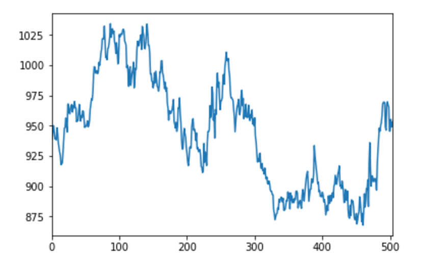
The above graph shows the last price for soybeans from 6/22/2015 to 6/21/2017 going from left to right.
Linear Regression
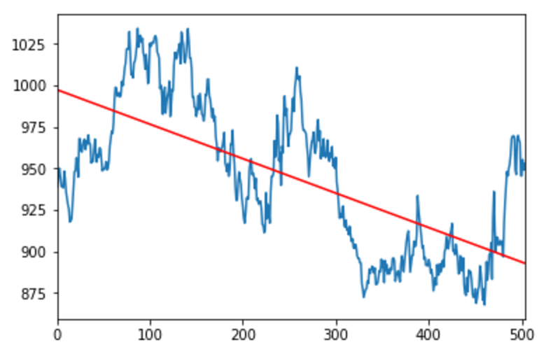
When looking at this data, we are interested in determining any trends going forward. There are a few techniques, but the most basic is a simple linear regression. With this technique, we attempt to find the best fit for a line through the points. For a detailed explanation on how to calculate the best fit line, check out https://onlinecourses.science.psu.edu/stat501/node/252. Thanks to the features of numpy, sklearn and pandas, finding the linear regression of the data set that we have is quite easy…
%matplotlib inline

import pandas as pd
import matplotlib.pyplot as plt
from sklearn.linear_model import LinearRegression
soydf = pd.read_csv("/Users/milesporter/data-science/data-sets/commodities/soybean-price-history.csv")
last_val = soydf["Last"]
last_val.plot()
X = pd.Series(range(1,len(last_val)+1)).values.reshape(len(last_val),1)
mdl = LinearRegression().fit(X,last_val)
m = mdl.coef_[0]
b= mdl.intercept_
print("Best fit line: y = {0}x + {1}".format(m,b))
plt.plot([0,505],[b,m*505+b], 'r')
(Again, I am using notepad above and hence “%matplotlib inline”)
The above code results in the following chart:
Polynomial Regression
When fitting trend lines to data, we don’t necessarily have to stick with just straight lines. We can use a similar technique to fit a polynomial function to the data as well. Consider this example which fits a 3rd degree polynomial to the data.

In addition to using the sklearn module to create regressions, we can also use the standard numpy module. You can see both approaches in the following example.
%matplotlib inline

import pandas as pd
import numpy as np
import matplotlib.pyplot as plt
from sklearn.linear_model import LinearRegression
soydf = pd.read_csv("/Users/milesporter/data-science/data-sets/commodities/soybean-price-history.csv")
last_val = soydf["Last"]
last_val.plot()
X = pd.Series(range(1,len(last_val)+1)).values.reshape(len(last_val),1)
mdl = LinearRegression().fit(X,last_val)
m = mdl.coef_[0]
b= mdl.intercept_
print("Best fit line: y = {0}x + {1}".format(m,b))
plt.plot([0,505],[b,m*505+b], 'r')

# As an alternative tosklearn, we can use numpy polyfit...
coefs = np.polyfit(X.reshape(-1,1)[:,0], last_val, 3)
print('Best Fit 3rd Degree Ploynomial: y = ({0})x^3 + ({1})x^2 + ({2})x + ({3})'.format(*coefs))
p = np.poly1d(coefs)
plt.plot(X, p(X), "r--")
The code above results in the following chart:
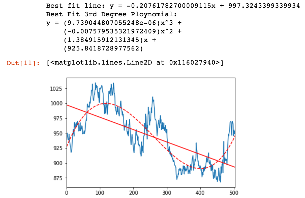
In the above chart, the solid red line represents the linear regression, or “best fit line” and the dashed red line represents the third degree polynomial regression for the same data. Note that the line shows a downward trend, and the polynomial shows an upward trend at the right side of the chart. This is particularly interesting, especially if you were a speculator in the area of soybean futures.
Conclusion
So, which is “right”? Well, the data contained in the chart ends with the last price as of June 17, 2017. That value is $939.25 for 5,000 bushels ( Soybeans Nov ‘17 (ZSX17). The current price (as of 2:20pm on June 21st, 2017) for the same contract is $926.2. From that data, it would appear that the linear regression line is a better estimator going forward. The 3rd degree polynomial looks pretty attractive, however.
Regressions, both linear and higher degree polynomial, provide a useful data science tool for interpolating and extrapolating data. Higher degree polynomials can provide a better “fit” or (smaller residual error) over data sets, however they tend to “blow up” outside of the domain that they are fitted to.
I hope you have enjoyed this little adventure in commodities and regression of soybeans. Check back soon to this blog as I continue to explore topics in data science and machine learning.
More Info…
A few years ago an individual I worked with recommended a book by Emily Lambert titled The Futures. This book explores the histories of the Chicago Board of Trade and the Chicago Mercantile Exchange, and the evolution of futures trading. Be sure to check out this great book for some wonderful stories about the history of commodities and futures, and some of the many colorful characters that were a part of those institutions.