Basic Statistical Analysis using R
In today’s post, I am going to explore some pretty basic statistics using R. The data set that I will use will be https://github.com/fivethirtyeight/data/tree/master/san-andreas. This GIT folder contains the results of a survey that asked people about their fears of earth quakes. I am specifically going to determine, based on the survey, who has the greatest fears of “The Big One” striking California broken down by various demographic factors. The factors I will explore will include:
- gender
- age
- household income
- region (as in where they live)
The statistics that I will be looking at will be frequency and relative frequency of the responses to the multiple choice questions of the survey.
So, let’s take a look at the data.
The Data
The first thing that I noticed in the data is that the CSV that defines the data has some long column names defined. I edited the csv file and redefined the names:
fear
fear_big_one
big_one_lifetime
experienced
precautions
familiar_fault_line
familiar_super_volcano
age
gender
income
The specific “fear” column I am going after is “fear_big_one”. The literal text for this survey question was…
“Do you think the “Big One” will occur in your lifetime?”
#Answering the questions with R
In order to explore this question, I will need to get to the relative frequency of the above question data based on the criteria of gender, age, income, and region. I will be attempting to work with the “R Studio” open source application. I was disappointed with the stability of “r-gui”, and am hopeful that “R Studio” will be more stable.
Overall Fear
Here is one way to look at the “big one” question without regard to any demographics.
> overall = table(edata$big_one_lifetime)
> overall_rel_freq <- overall / nrow(edata)
> barplot(overall_rel_freq)
That produces the following chart:
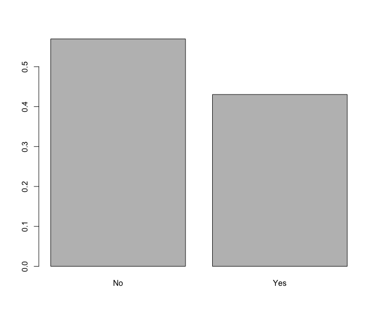
Based on this data it would appear that most people that responded to the survey feel that “the big one” is not going to hit in their lifetime. That is, I guess, somewhat reassuring. Let’s dig a little deeper…
Fear by Gender
To explore how people responded with respect to their gender, we can do the following:
> mfear = mdata$big_one_lifetime
> mfear.freq = table(mfear)
> mfear.relfreq = mfear.freq / nrow(mdata)
> mfear.relfreq
> fdata = edata[edata$gender=="Female",]
> ffear = fdata$big_one_lifetime
> ffear.freq=table(ffear)
> ffear.relfreq = ffear.freq / nrow(fdata)
> blist <- c(mfear.relfreq, ffear.relfreq)
> names(blist) <- list("Male no", "Male yes","Female no","Female yes")
> barplot(blist)
That results in the following chart:
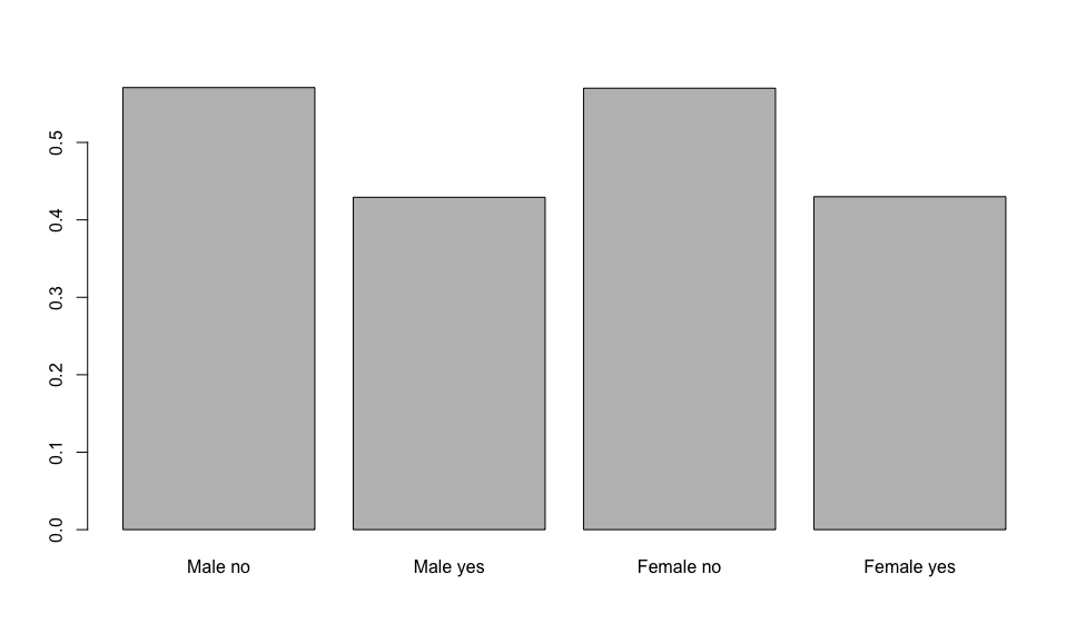
Based on this, it would appear that both men and women feel similarly that “The Big One” is not going to hit in their lifetimes.
Fear by Age Group
To answer the fear by age group question, I needed to get a bit smarter about things. There are several age categories, and I didn’t want to create separate factors for each one (mfear and ffear in the previous example).
I started by creating a tabled based on the age question:
> afear = table(edata$age, edata$big_one_lifetime)
> afear

           No Yes
            6   6
  18 - 29 127  88
  30 - 44 137 120
  45 - 59 154 121
  60      153 101
The next step was to create a relative frequency across each row. I wanted to compare which age group was relatively more afraid, taking into a count that there are a different number of people in each age group.
> a_rel_freq <- prop.table(afear,1)
> a_rel_freq

                 No       Yes
          0.5000000 0.5000000
  18 - 29 0.5906977 0.4093023
  30 - 44 0.5330739 0.4669261
  45 - 59 0.5600000 0.4400000
  60      0.6023622 0.3976378
Next, I checked this to make sure that the numbers were correct. The second row has 127 + 88 = 215 answers. So we would expect the relative frequence of the No answers for 18-29 year olds to be 127/215 = 0.590697674418605, which is correct based on the table above. (This does call into question the precision of the calculations. I am going to pass over that for now. It may be an interesting topic for another blog post.)
Since the a_rel_freq data frame above appears to have the data we want, we can now graph it…
> barplot(a_rel_freq, beside=T, col=terrain.colors(5))
> legend("topright", cex=0.75, title="Age Groups", rn, fill=terrain.colors(5))
That produces the following chart:
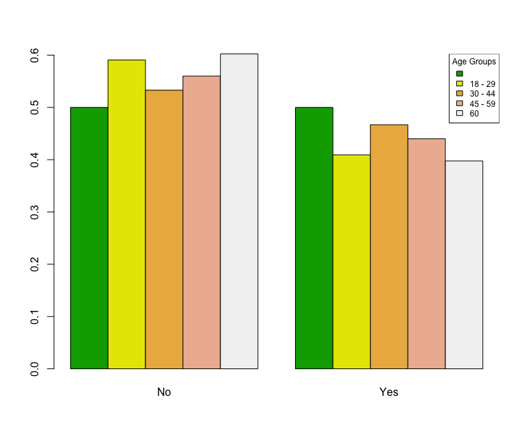
From this we can see that the 18-29 group is particularly confident that the big one is not going to happen in their lifetimes. That is particularly interesting because they have the longest to live of all the respondents. The other thing that we can notice is that the “no answer” people are split 50/50… but that is misleading. The total count of that column is 12 (with 6 yes and 6 no). That is an awful small number. This brings into question the margin of error for these questions. I am not going to delve into those questions here, but rather just mention them. Again, potentially something for a future blog post.
Fear by Income
The next chart is similar to the chart above, but this time we will look at household income level…
> ifear = table(edata$income, edata$big_one_lifetime)
> i_rel_freq <- prop.table(ifear,1)
> barplot(i_rel_freq, beside=T, col=terrain.colors(12))
> il = rownames(i_rel_freq)
> legend("bottomright", cex=0.75, title="Income Level", il, fill=terrain.colors(12))
>
That produces the following chart:
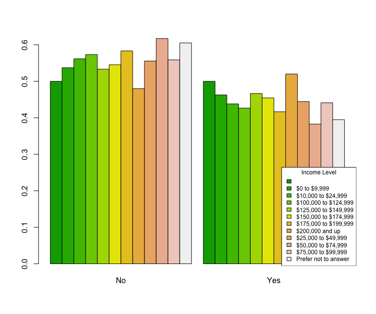
This chart would be much easier to read if the data were sorted specifically by category range. By default, the table is sorted by alphabetical name of the category. It is possible to sort this data by the numerical value. I am not going to do that now, however… By inspection on the chart, we can see that the the biggest discrepency is for people that make between $50k and $75K per year. These people seem to be extra sure that they will not experience “The Big One.”
Fear by Region
Lastly, we have fear by region. Again, this was similar to the previous two examples…
> rfear = table(edata$region, edata$big_one_lifetime)
> r_rel_freq <- prop.table(rfear,1)
> barplot(r_rel_freq, beside=T, col=terrain.colors(10))
> rl = rownames(r_rel_freq)
> legend("bottomright", cex=0.75, title="Region Level", rl, fill=terrain.colors(10))
That produces the following chart:
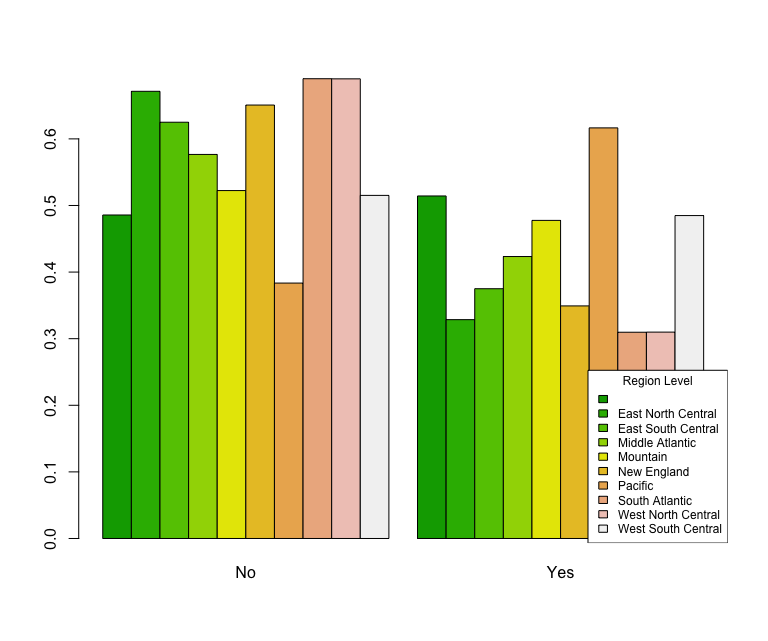
This chart shows that people that live in the Pacific region feel that “The Big One” is much more likely than people that live in New England. That is not too surprising based on the fact that people in the pacific states experience far more earth quakes than those on the east coast. https://earthquake.usgs.gov/earthquakes/browse/stats.php
Conclusions
So, based on the above analysis, we can say:
- Men and women are similar in their fears of a castrophic earth quake (“The Big One”) striking in their lifetimes. However, those fears are below 50%.
- 30-44 year olds have the greatest fear of a catastrophic quake. Again this fear is still less than 50%.
- Households that make between $50K and $75K feel fairly confident that “The Big One” won’t happen in their lifetimes.
- People in the South Atlantic States responded that they think California is not going to experience “The Big One” (65%). However, a majority of people in the Pacific states responded that they think “The Big One” will happen in their lifetime (62%).
What value is there in this analysis… arguably very little, unless you are interested in where and who to market earth quake insurance too, I suppose.
I have found some of this work interesting, and yet somewhat frustrating. The “R” language seems to me to be fairly unintuitive. That, however, could be that I am more experience with Python.
Be sure to check out my next post as I continue to expore some of the basics of data science and related topics.